| Project Description | the completion date – 01-01-2021 COST: 10 lakhs
Project Note
0% CARBON FOOTPRINT DESIGN (restaurant design )
Mitti ke Rang (Hindi language) (Clay and colours of clay – Reviving AGE-OLD CRAFT
The evocatively named Mitti ke Rang is a restaurant in Ahmedabad that facilitates the basic human need of socialising with social distancing in an ambience that respects the earth following the philosophy of biophilia. With the use of local organic materials — especially clay — local craft and labour, the project is an attempt on the designers part to acknowledge the consumerism of today’s world, and in a small way, contribute to minimising the waste generated by prevalent urban attitudes and lifestyles.
By a wonderful coincidence, the respectfulness towards resources and earth-energies that are the founding principles of our practice converged with the owners’ family links to pottery, and its inextricable connections to the earth. The attempt, then, became to build up this connection, heritage, and talent in the new venture. “we told the client to let his family, who is still into this craft, use their talent, and, in turn, and we would use these various forms of the traditional vernacular material in the restaurant. We are inclined to creating design that is both, high on environment-sensitivity and aesthetics. “This way, we could subtly but emphatically illustrate the family skill.” The weaving of vernacular and technology, and the collaboration and contribution of the local stakeholders in the family and the architects has resulted in spontaneity and diversity in the design.
The hero of the entire narrative, undoubtedly, is clay. The mouldable, green and versatile material is explored both, as a medium of creating objects as well as surfaces. Its combination with dye extracted from the flower of the kesudo (flame of the forest) tree, turmeric, grain husk and a natural binder created a material distinct in colour and texture, one that resonates the theme and the spirit of the design. And thus, the name Mitti ke Rang. The material development and research were done on site, and the design team takes pride in the fact that no artificial pigment or additives were used in the process.
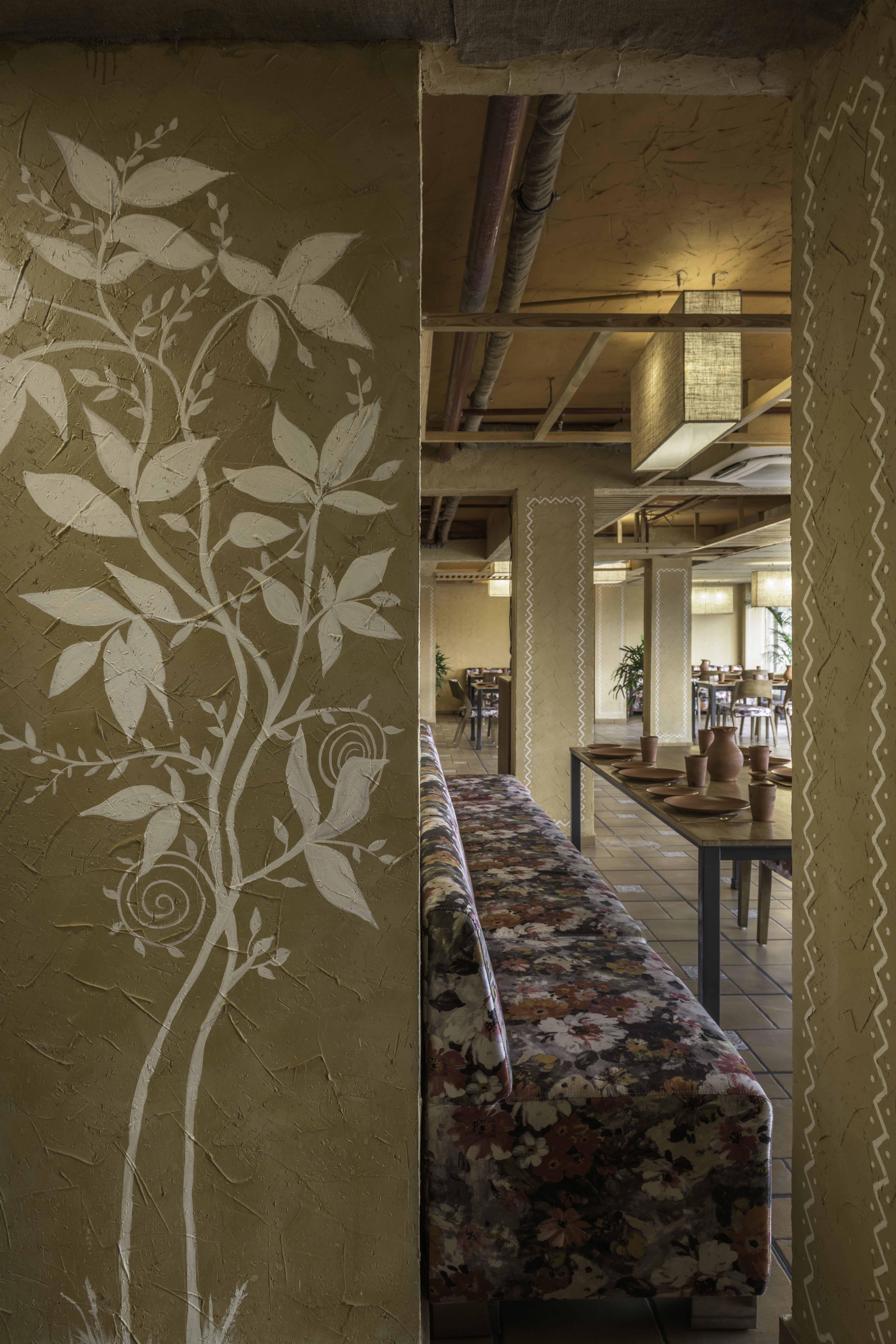
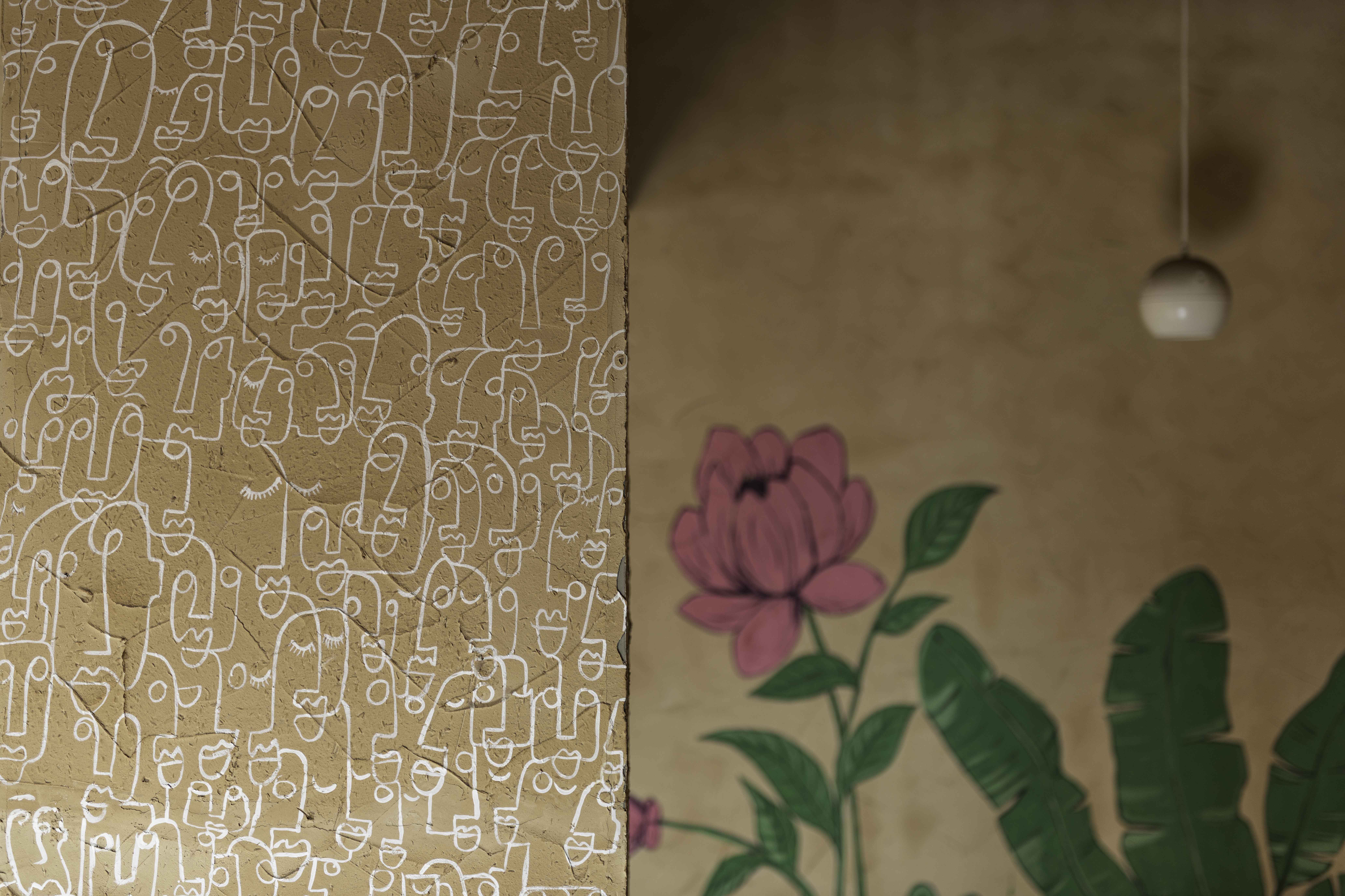
Both, the colour, and texture of this earth-friendly plaster celebrate India’s cultural wealth. The glorious golden shade, bearing associations with joy, health, positivity, and happiness, evokes auspicious moments and festive occasions, especially in the Indian context. The texture of the surface, with its beautiful, handcrafted look and wave-like designs that trace the rhythm of hand movements, recalls simpler times when our connections to nature and the environment were much stronger.
The expression of the central material is ably supported by reclaimed wood, reclaimed jute, unfired clay vessels and terracotta tableware. These make the spatial narrative richer and more enjoyable, and at the same time convey the commitment to build with a respect for the place we inhabit resulting in Low embodied energy. “Awareness is human quality,” states Bhadri Suthar, who co-helms the practice with her spouse. “But what you do with that awareness is important.”
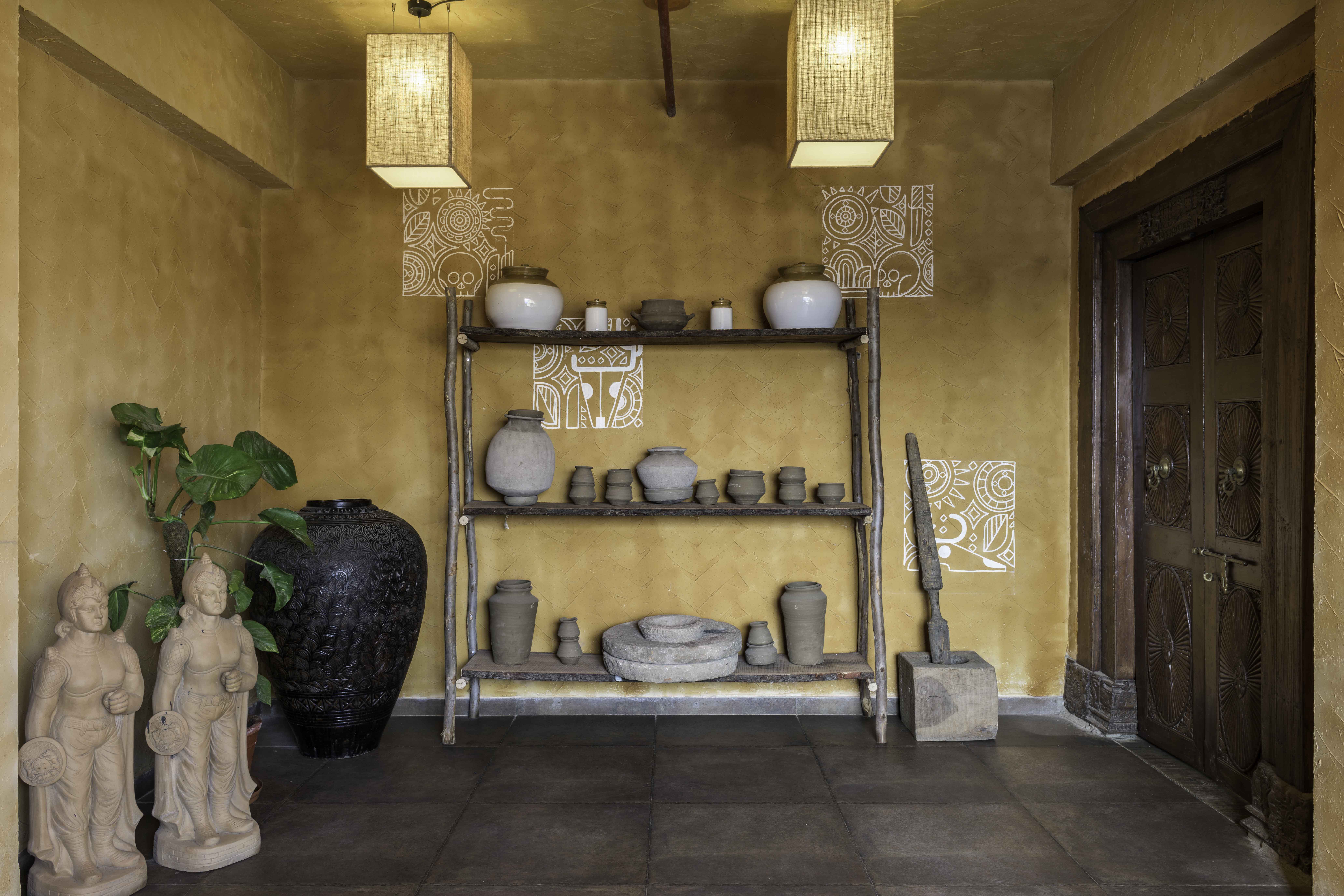
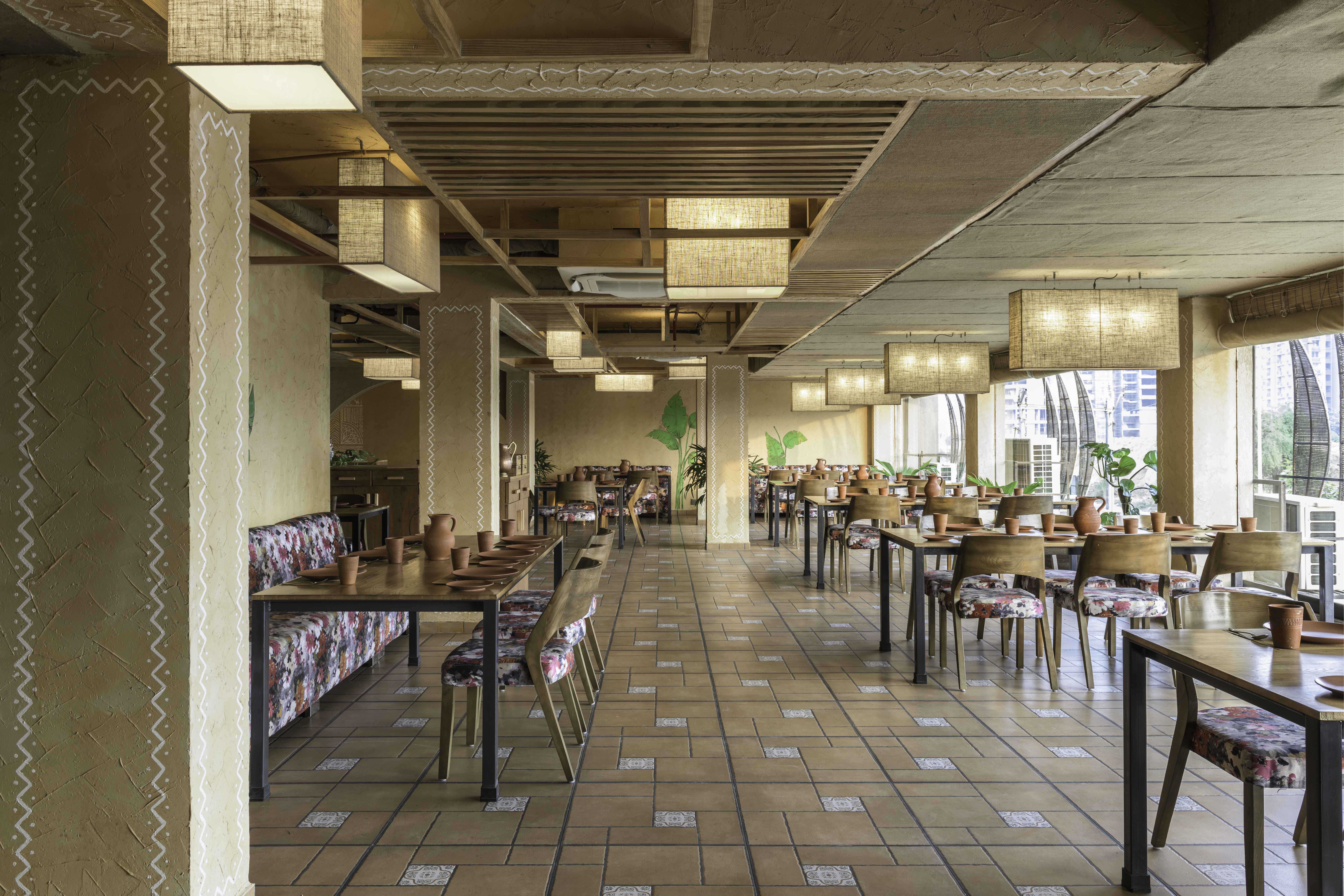
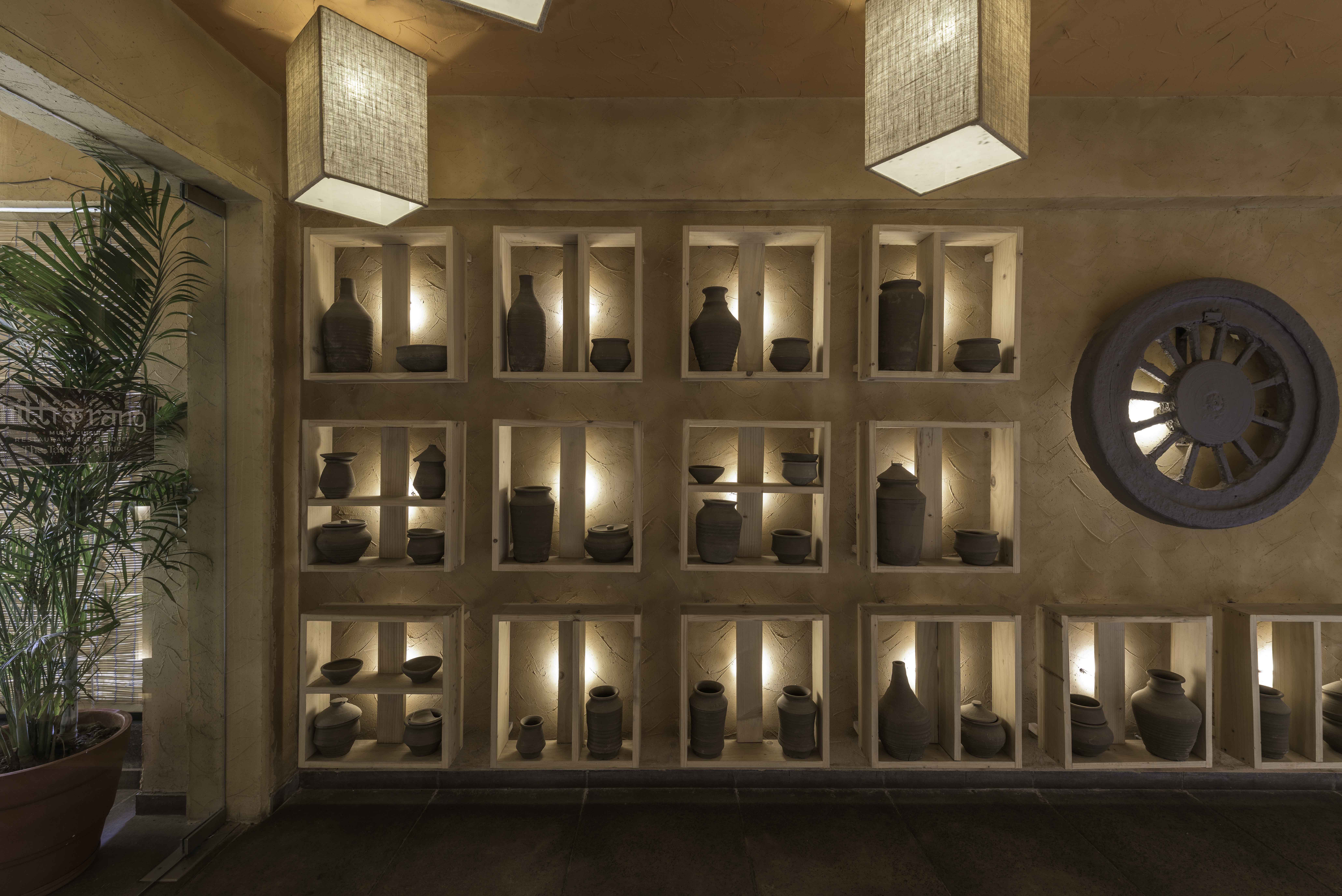
The design takes the route of simplicity, clean-lined forms and uncluttered interiors. “An effortlessness that arises from a true and honest approach,” says Snehal Suthar, co-founder and principal at The Grid Architects. The entrance symbolises the client’s heritage, our culture and the theme of the restaurant. A potter’s wheel and different types of clay vessels and utensils, gently illuminated by reclaimed jute-shaded lamps, extend a warm welcome. The waiting area and anteroom continues the tale of cultural legacy by showcasing objects from the client’s ancestral home — notably a hand pounder/grinder, and the white and green pots. The linear programme inside is designed parallel to the glazed, road-facing windows in order to leverage views and natural light. This animating force combines with earthy colours, subtle textures and the freshness of plants to create an energised experience that speaks of the well-being of both, the body and soul. Cosy seating islands with chairs and comfortable wall seating with sofas provide private, comfortable dining spots that are at once open, yet private.” This dine-in is designed to work in harmony with nature, and to trigger diverse sensations to encourage the visitor,” “For instance, we hope that the person who experiences the space over time gets an idea about how the material will change colour naturally with time, as well as through the way it reacts with light.”
Triumphing over constraints posed by budget and a short timeline of 60 days, we successfully delivered a space that is rooted to the earth and crafted from it. SUSTAINABLE, LOCAL CRAFT, TRADITION, VERNACULAR, LOCAL LABOUR.
|
|---|
| Materials Used | Reclaimed wood (ceiling and furniture)
Reclaimed jute (lamps and screens) from wedding mandap
Natural organic paste (walls and ceiling) (dye extracted from the flower of the kesudo (flame of forest) tree, turmeric, and other organic ingredients like hay and natural glue called sares)- Golden Plaster was developed on site.
Local ceramic tiles (floor)
The hero of the entire narrative is clay. The mouldable, green versatile material is explored, as a medium of creating objects and surfaces. Its combination with dye extracted from the flower of the kesudo (flame of the forest) tree, turmeric, grain husk and a natural binder created a material distinct in colour and texture. The central material CLAY is ably supported by reclaimed jute, wood, unfired clay vessels and terracotta tableware. The material development and research were done on site, and the design team takes pride in the fact that no artificial pigment or additives were used in the process reducing the carbon footprint, emphasizing the notion that eco-friendly interiors can be low-cost while also being sturdy and luxurious in appearance. We saved on material and labour cost and arrived at a special concoction after multiple trial and errors with Golden Plaster. The final outcome of the surface treatment was one that not only made the walls sturdy but also released a natural fragrance. The colours and texture resonate with the theme and core design. Clay has now become an integral part of our lives and we can never get enough of this earthen material that provides warmth and a peculiar texture.
|
|---|

